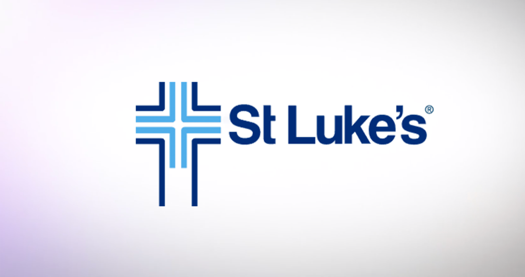
It is one of the most recognizable and durable logos in Idaho. Soon, it will begin to fade away.
St. Luke’s Health System quietly began rolling out a new logo in September. It retains the signature blue color but removes the long-standing “double cross” icon, which featured a medical cross nestled within a Christian cross. It will appear on hospitals, clinics, and offices from Boise to McCall to Ketchum in the years to come.
St. Luke’s spokesperson Christine Myron told BoiseDev that the new branding grew out of a desire to unify the many different parts of the now-sprawling health system, its insurance arm, and other parts of the organization.
“Aligned with our mission to improve the health of people in the communities we serve, St. Luke’s has evolved to become a more integrated health system, providing care in our hospitals and clinics, connecting our communities to care providers through our health network, and funding as well as expanding access to care through St. Luke’s Health Plan,” she said. “Our updated logo unifies the many parts of our system into a cohesive identity, emphasizing our commitment to quality, community-focused care.”

The logo no longer includes an icon, but sets “St Luke’s” in a modern typeface with rounder letterforms than the version it replaces. It uses two blue colors, both brighter than the ones previously used. The apostrophe in “Luke’s” is used in some branding assets as a window element for creative and as a repeating pattern.
The older logo dates to the 1970s, according to BoiseDev research.
While the dual cross is no longer on the primary logo, Myron said it will still appear.
“Our cross is an important symbol for St. Luke’s, and it will remain in many prominent spaces, such as on our hospitals, as we continue to honor our history and uphold our values,” she said.
The logo change will be phased in. It now appears on the health system’s new website, social media channels, and the MyChart app. A matching logo will be used for St. Luke’s Health Plan after the open enrollment period ends. In the many other hundreds of thousands of places the logo is used, it will be phased in over time.
St. Luke’s worked with Boise branding firm Mitchell Palmer to develop the identity.
“St. Luke’s is taking a phased approach, which means people will see overlap between the legacy logo and the updated logo on and within our facilities and across digital and printed materials,” Myron said. “Updates to printed materials, such as letterhead and educational pamphlets, will happen as they naturally need to be updated or replaced.”
St. Luke’s was founded in 1902 by the Episcopal Diocese of Idaho. The diocese gradually lessened its involvement in the hospital, and in 1947 it became a stand-alone non-profit. The church remained directly involved through to the early 1970s, according to Myron.


